Title Sequence Research
Title Sequence Research
1. Scott Pilgrim vs. the World (2010) Directed by Edgar Wright
Scott Pilgrim vs. the World is an explosive film, combining dramatic editing, rock, and action, becoming a cultural classic in this generation. The title sequence begins with an 8-bit Universal logo screen, which is a 3D rotating globe that is pixelated with a lower frame rate and introduces the story and the main characters. Thus, the audience might feel that they are entering a game through this opening with a sense of nostalgia from the poor quality. Then, the band begins playing spontaneously as it backs up into a long, trippy room from the band to the couch, leading the credit to evoke an admirable mood as they enter their movie world in a mind-blowing way. At first, the title sequence was going to be opened with studio credits, then the title of the band playing in the living room with credits at the end with a black background. However, it was revised to allow the audience to settle into the plot. Plus, the credits were behind a background created by scratching on sheets of acetate and kicking around to pick up pieces of dirt. The colors went through a high-resolution scanner and color changes. This provided a more impactful title sequence with a sense of occasion, and the loudest soundtrack further added more power to provide adrenaline to the audience to excite them for the rest of the crazy movie. They needed something that would suggest a game-like film, so Shynola was chosen for their animation from their music videos that had detailed animation to emphasize each and every character and their music. Moreover, the ending focused on a close-up of Knives' reaction as they wanted the audience to dive into Knives' mind as she watched the music and her admiration of the text-style graphics, color, and lights that match the music. The editing is extremely explosive, which makes it stand out. Not only is Knives mesmerized by the crazy music, but so is the audience as they see the music pop out from around them, leaving them at the edge of their seats, blown away by what they just witnessed. Overall, the title sequence is unique as it creates the look of an arcade game and leaves the audience amazed at what they just watched from its quirky and loud combat game design.
2. Elf (2003) Directed by Jon Favreau
Elf, directed by Jon Favreau, is an iconic and classic Christmas movie made in 2003 with comedic charm and a unique storyline. It is largely inspired by childhood favorites, such as Rudolph the Red-Nosed Reinder, A Charlie Brown Christmas, and Miracle on 34th Street. The title sequence begins with a book opening to an elf, showing elf life, and then the book continues to flip, showing the film credits to introduce the audience to the story. Hence, the use of the Christmas-designed book makes the audience feel as if they are children again with the warmth and familiarity of the holiday spirit with the inspiration of similar films. The opening sequence was created using a 30-inch tall book that needed to be stable for each frame that was taken one at a time. THAT'S HUGE! Moreover, the book had to have papers that needed to be weighted to have the correct curl for the animation, so they ended up using vinyl paper. I find it funny that Kent Burton, who was an animator, had to use fishing wire to turn each page, and the book filming was choreographed. Surprisingly, it was all one shot as the book turned from one page to the other. Thus, this allows it to look like a real children's book is being flipped as if it's being read to them like a bedtime story to immerse the reader into the elf world and evoke a cheerful mood. Then, they animated characters into the sequence, like the puffin, which has a similar design to classic and older Christmas movies. Therefore, the film is not just enjoyable for kids but also for adults as it enables them to reminisce about their childhood in a light-hearted way. The typeface was Curlz due to its classic holiday look, which was a unique choice to hint at its jolly nature to the audience and get them in the holiday spirit. All in all, this really captured the holiday spirit of other classic films that they were trying so desperately to achieve in the title sequence, down from the book and animated animals to the font of the titles to evoke the fuzzy and warm feeling of Christmas when they were kids.
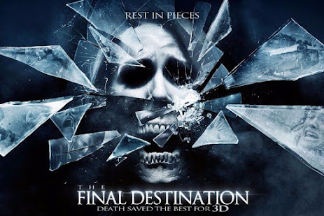
3. The Final Destination (2009) Directed by David R. Ellis
The Final Destination (2009) is a horror movie consisting of horrific deaths of individuals who avoided death when they were not supposed to after somebody received a vision of their death. The title sequence is 3D animation, revealing different deaths from the Final Destination franchise from the first three movies, which allows the audience to foreshadow the movie, evoking a foreboding mood just from the opening sequence. In fact, the idea was an X-ray concept with their own actors instead of the actual actors from the movies and scenes that did not show the actors, and they used a shader in their 3D software and compositing software with different layers to enhance the previous deaths in other movies to make the audience surprised at the unique concept and deaths to get their blood pumping. The typography was inspired by actual X-rays and the logotype of the marketing of the films, and they gave it a slight rotation to make it realistic to how a doctor would put it on a table with blood bleeding into the titles to set in the gruesomeness of the movie to make the audience feel a sense of apprehension of the deaths to come. Additionally, they composited the footage and changed the convergence to create depth. In summary, the title sequence has elements that are loved by fans, using 3D to create an innovative and fresh look to these grizzly films to intrigue them and create the classic suspenseful mood in a horror movie.


Comments
Post a Comment